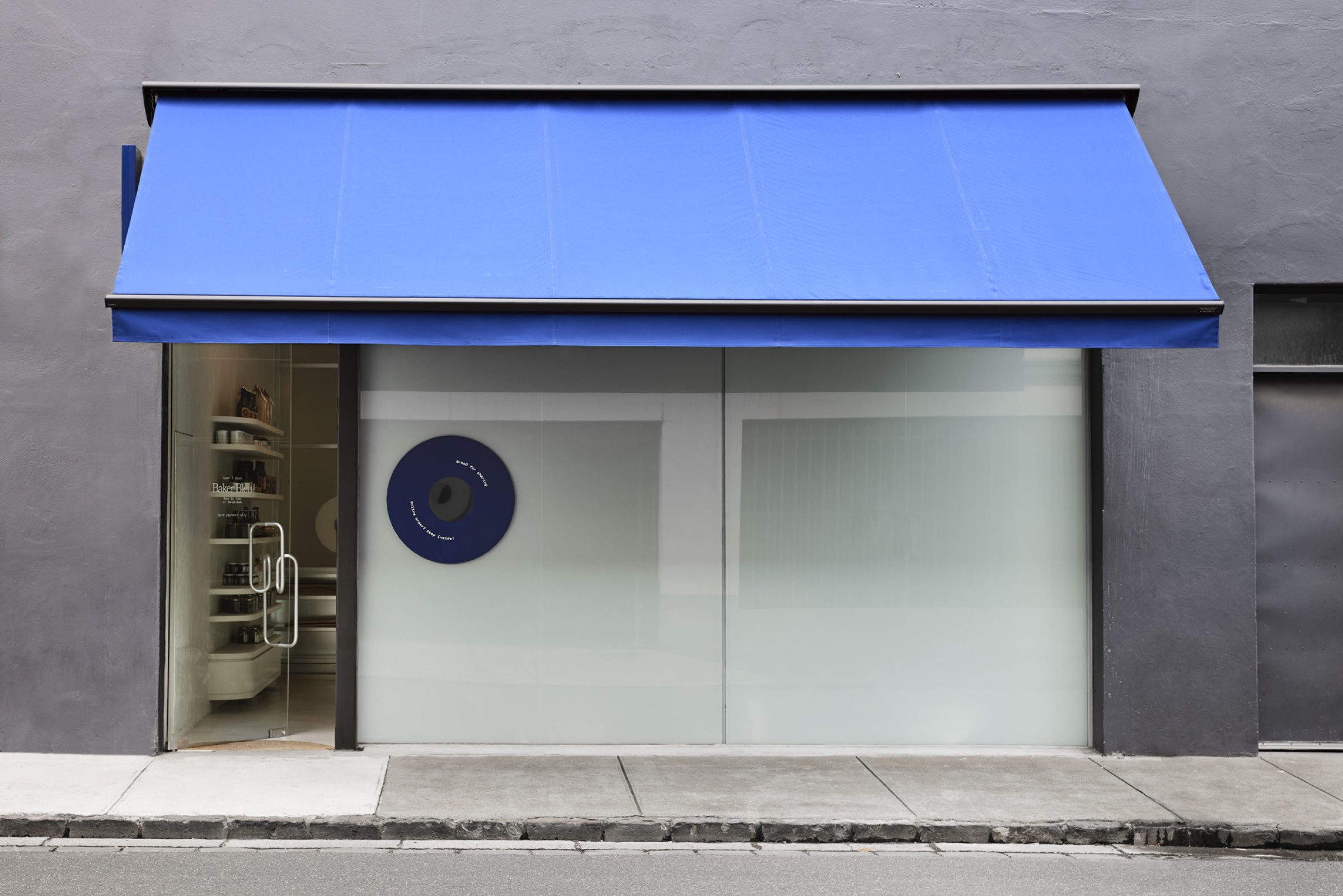
In four short years, Baker Bleu has established itself as a destination for quality sourdough bread. With a strong emphasis on a specialised retail offer and an expanded menu, the space looks to re-engage existing customers, attract local residents and provide a new and exciting experience every visit.
Baker Bleu, Hawksburn
Baker Bleu challenges the perception of bread as simply ‘ordinary’. It is elevated to be aligned with the values and principles on which the bread and pastries are made—as artisan—and therefore as art.
2021
Prahran, Wurundjeri Woi Wurrung Land
Floor Area
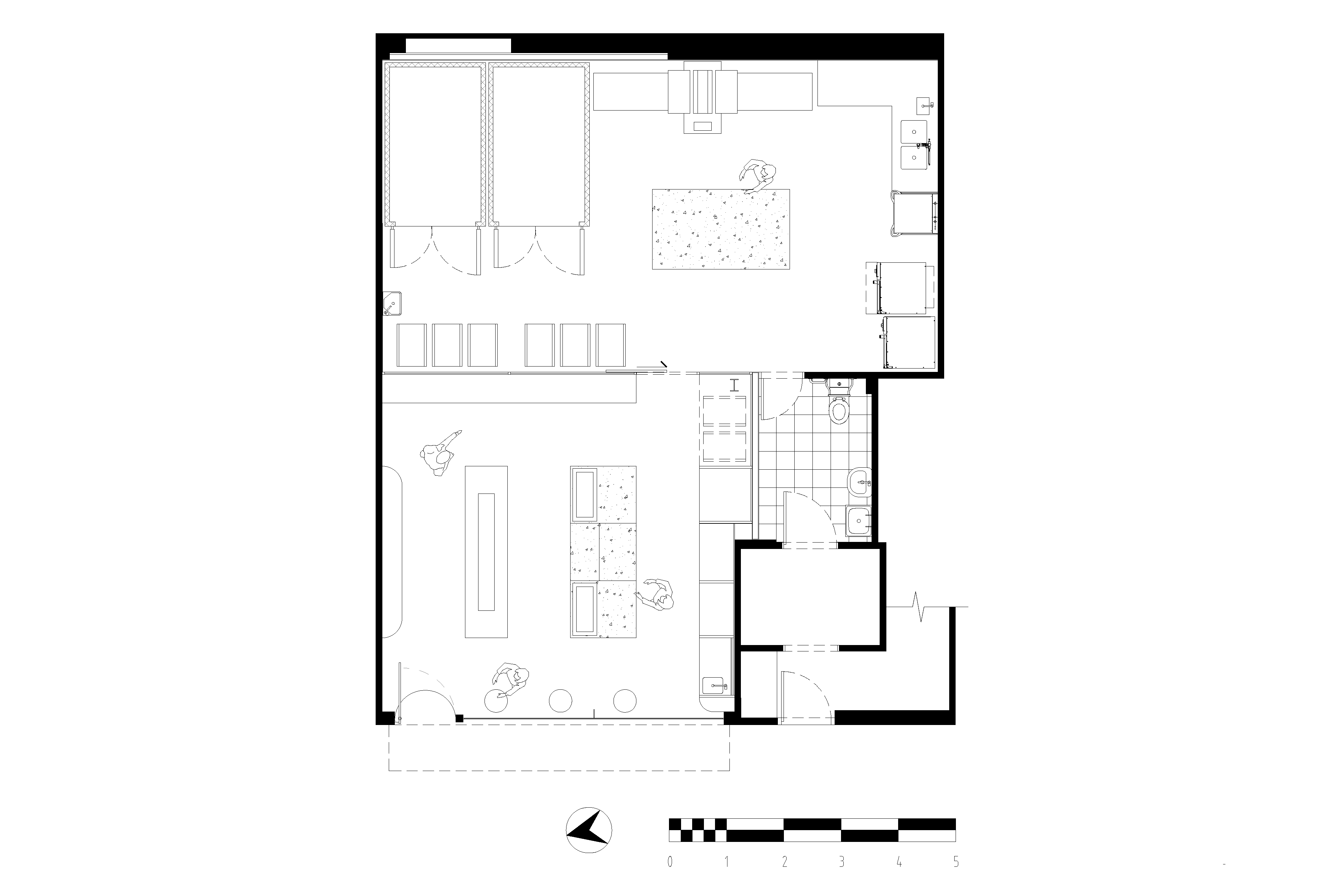
97m²
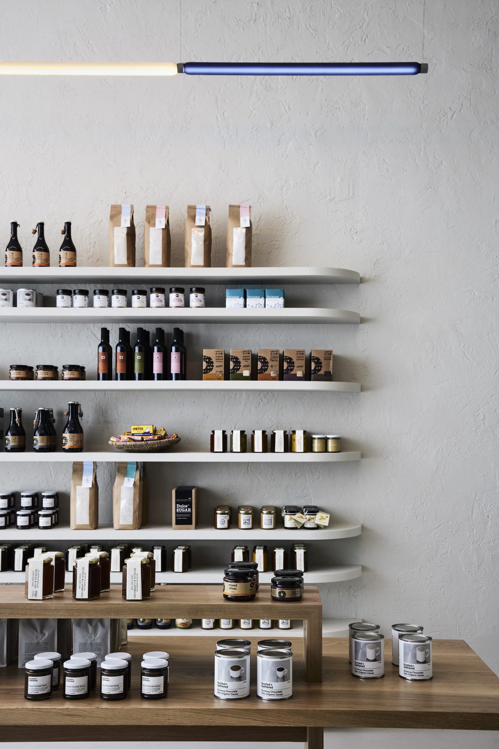
Utilising a raw, minimal, textural aesthetic, we have tightly focused the lens by which the products are viewed - eliminating the random and instead creating a rigid system by which to display and increase overall efficiencies of the business operation from baker through to server. We have used the tight footprint of the tenancy to our advantage, creating a flow of movement that takes the customer through the full offering of fresh baked-goods and curated pairings.
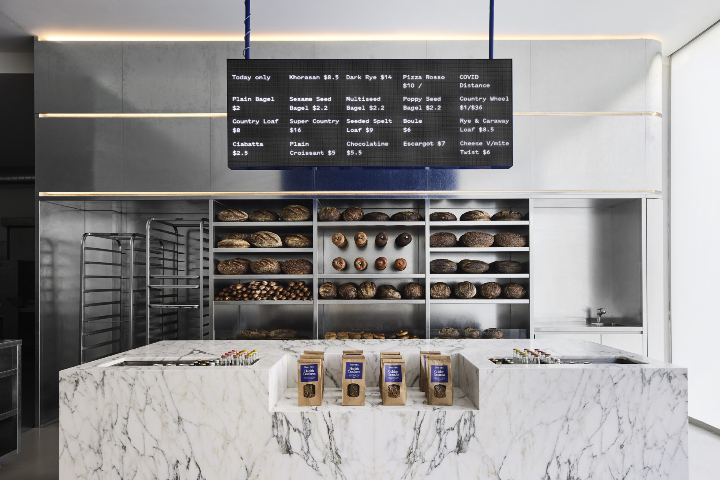
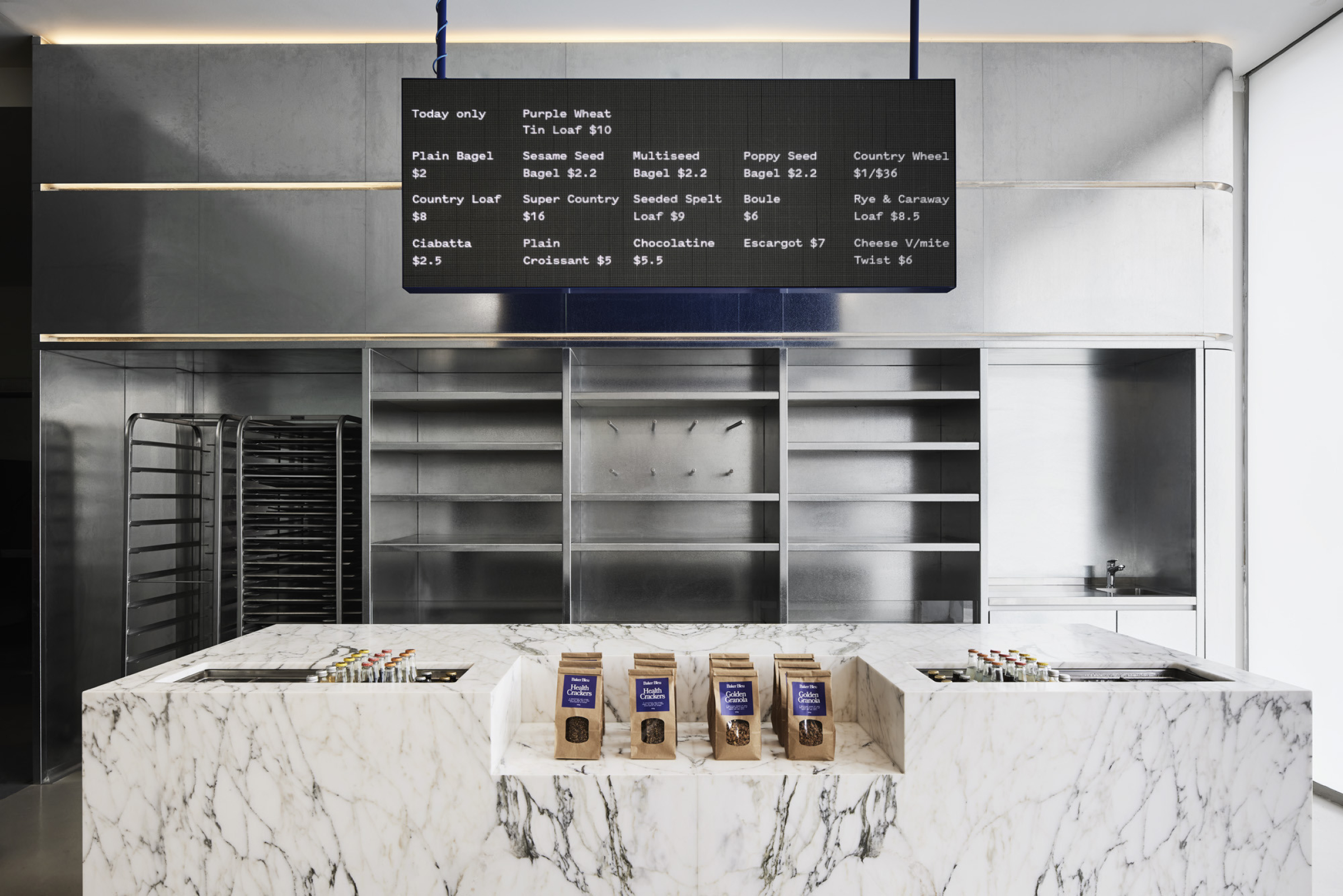
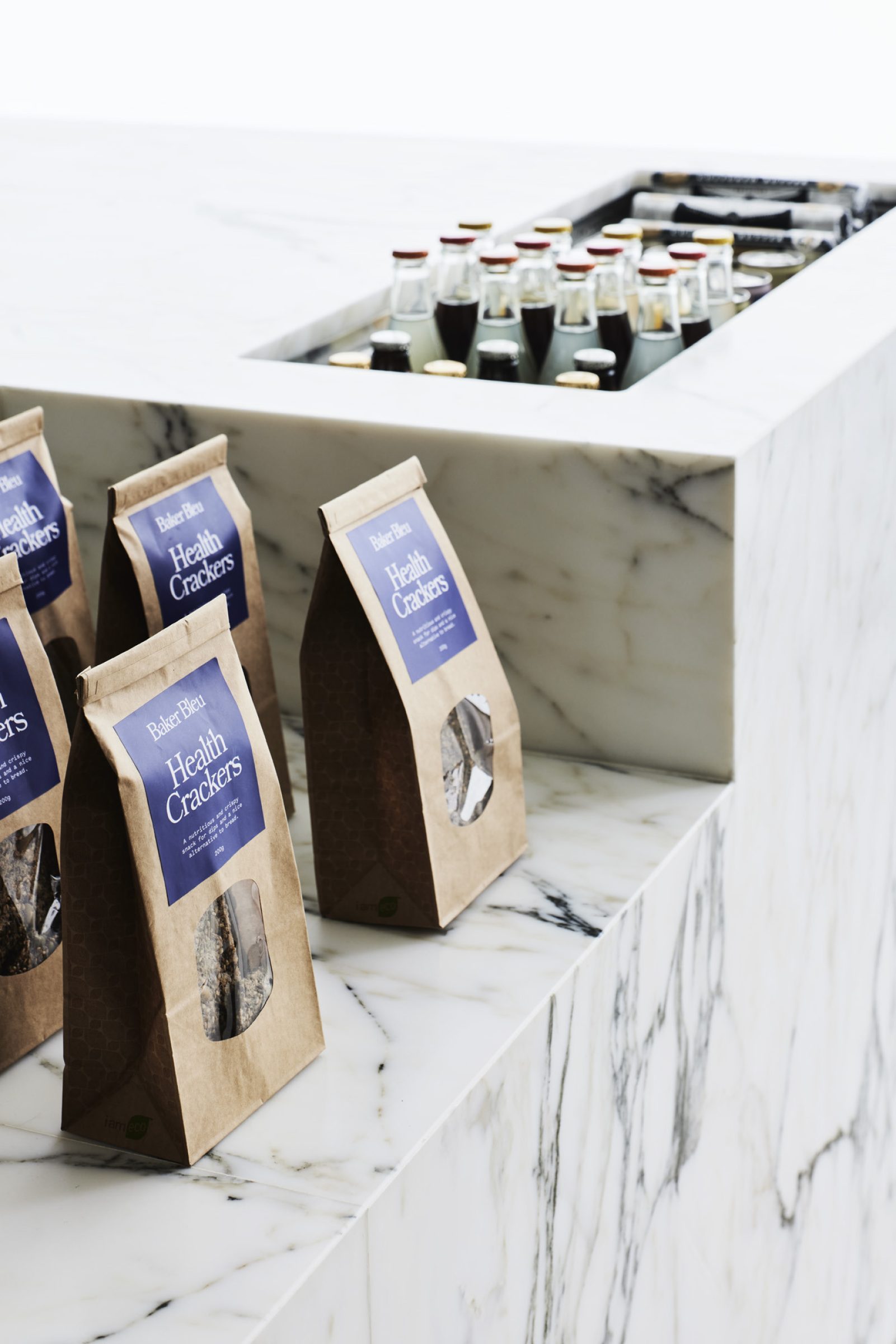
The space reflects the authenticity and quality of the product, using materials and gestures that feel familiar but are elevated through the accentuation of space, simplicity, and detailed execution. With a strong and devoted customer base, it was important to express the essence of Baker Bleu and speak to their motto of ‘Bread for Sharing’.
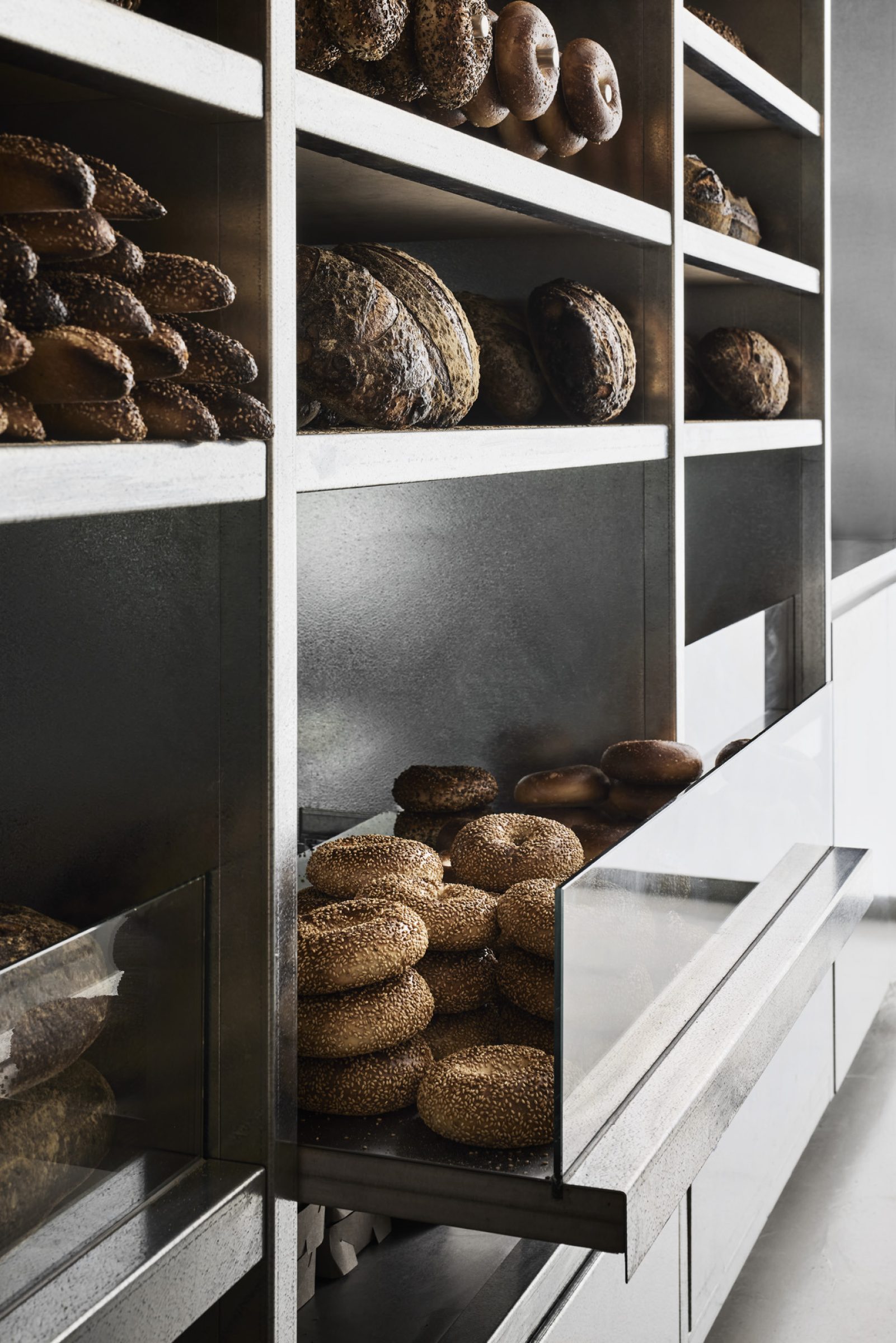
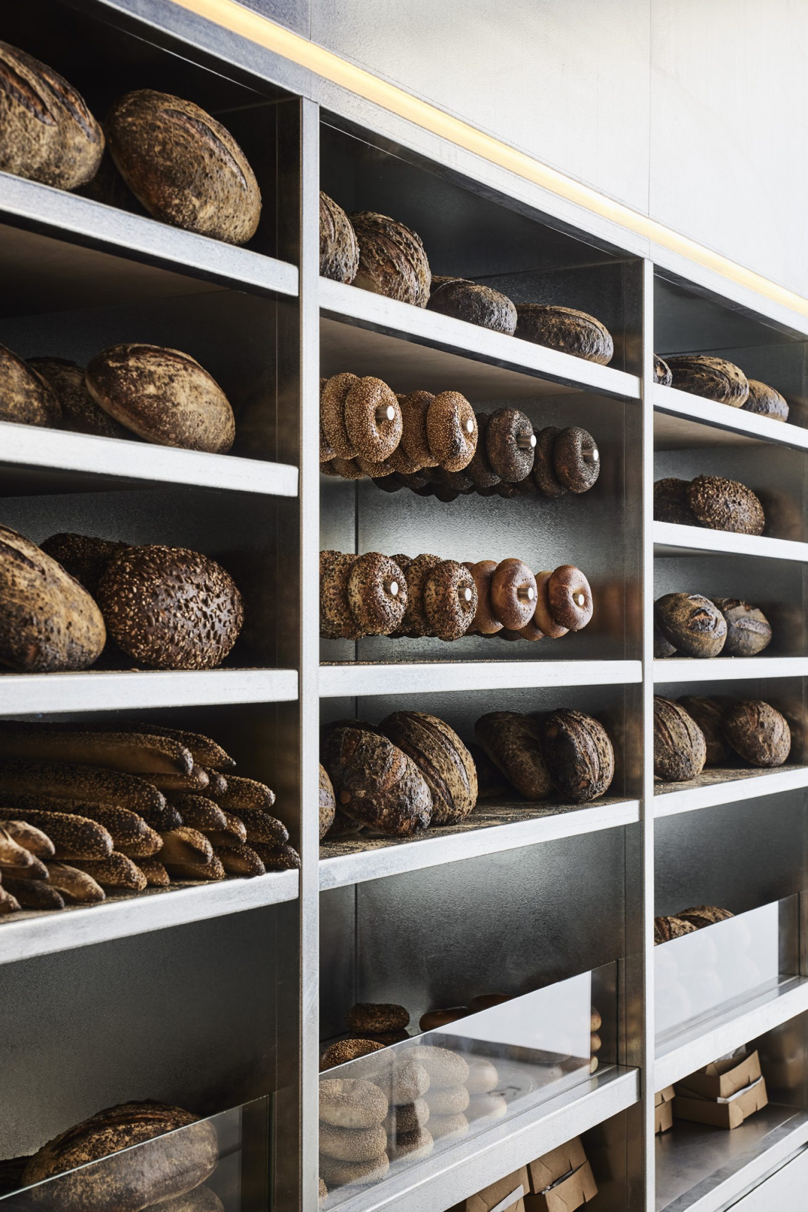
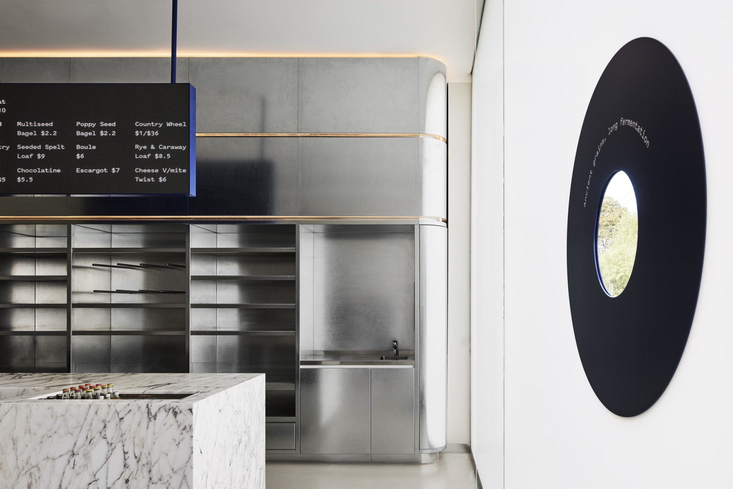
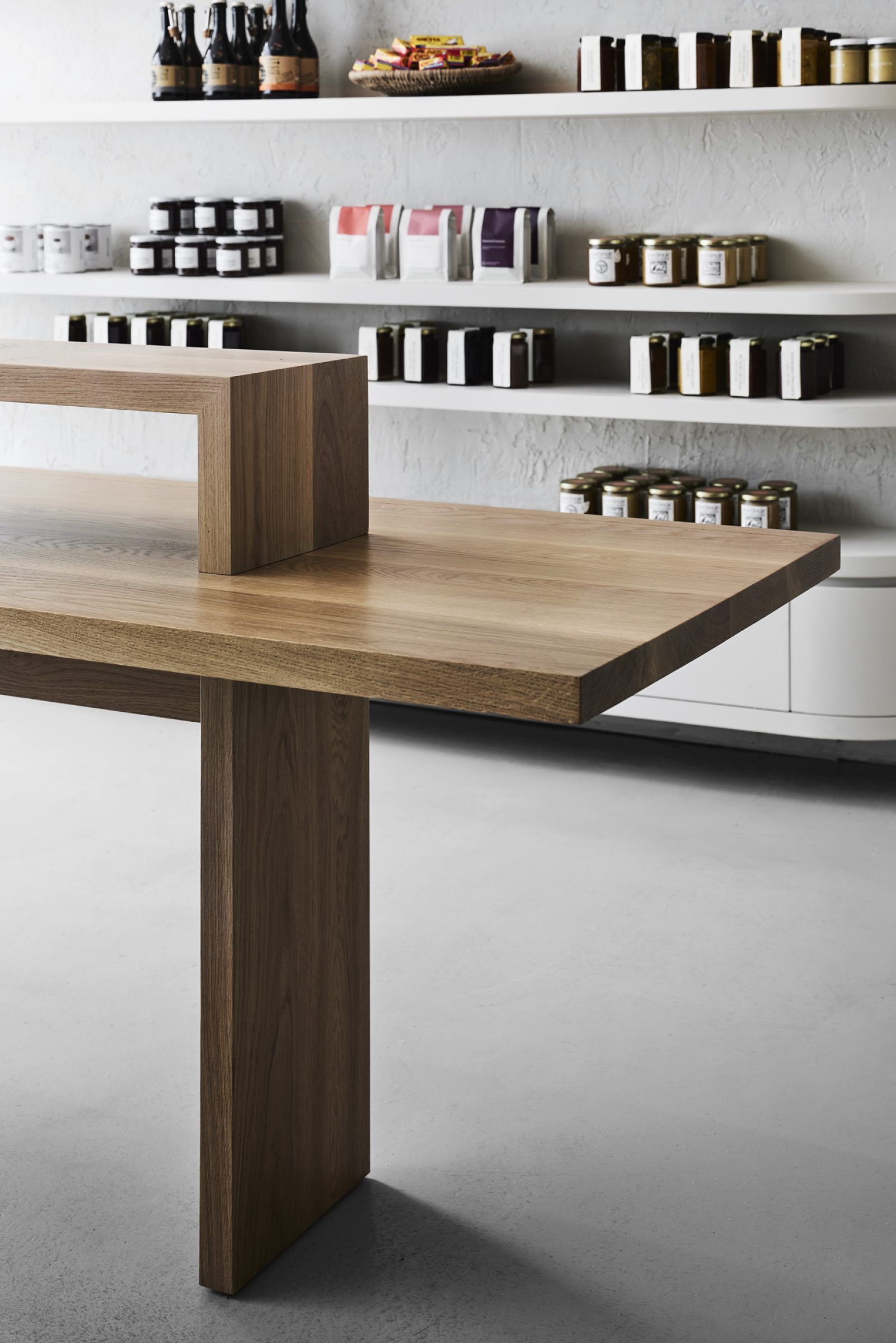
The interior is given a contemporary edge with a palette that includes natural stone, stained timber, rough cast render and galvanised steel; materials that speak to the individuality of the bakery and that will patinate over time, adding character and personality.
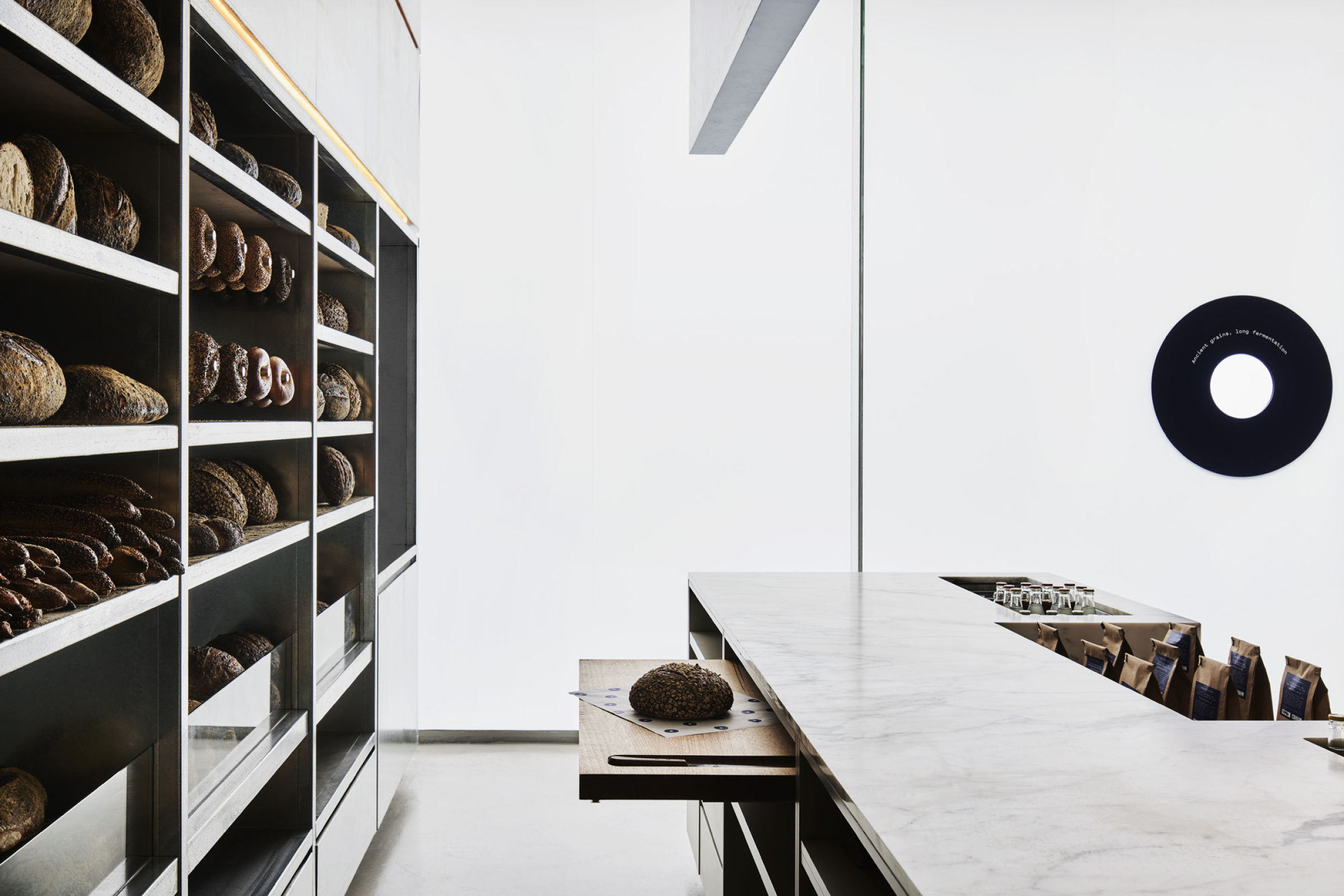
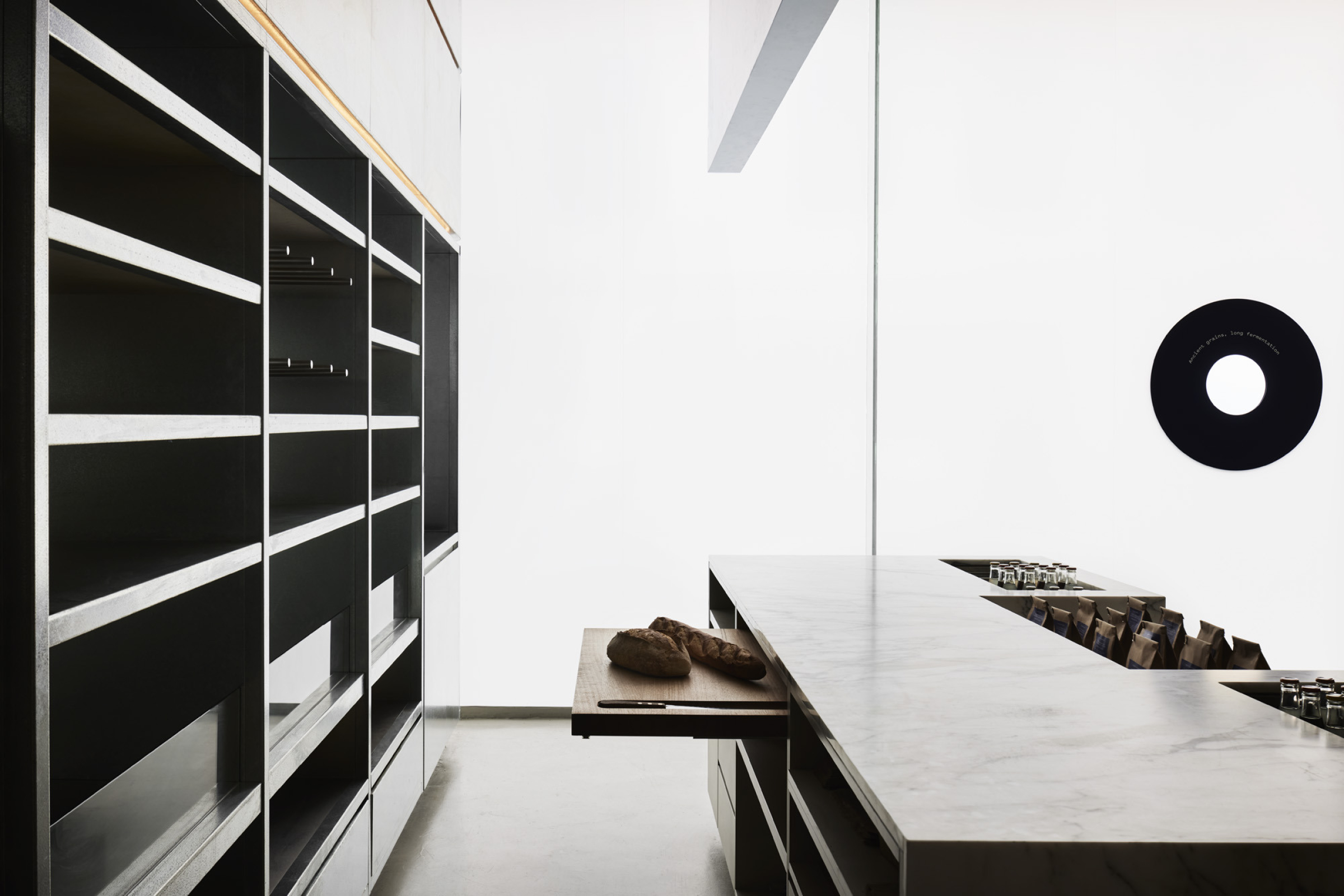
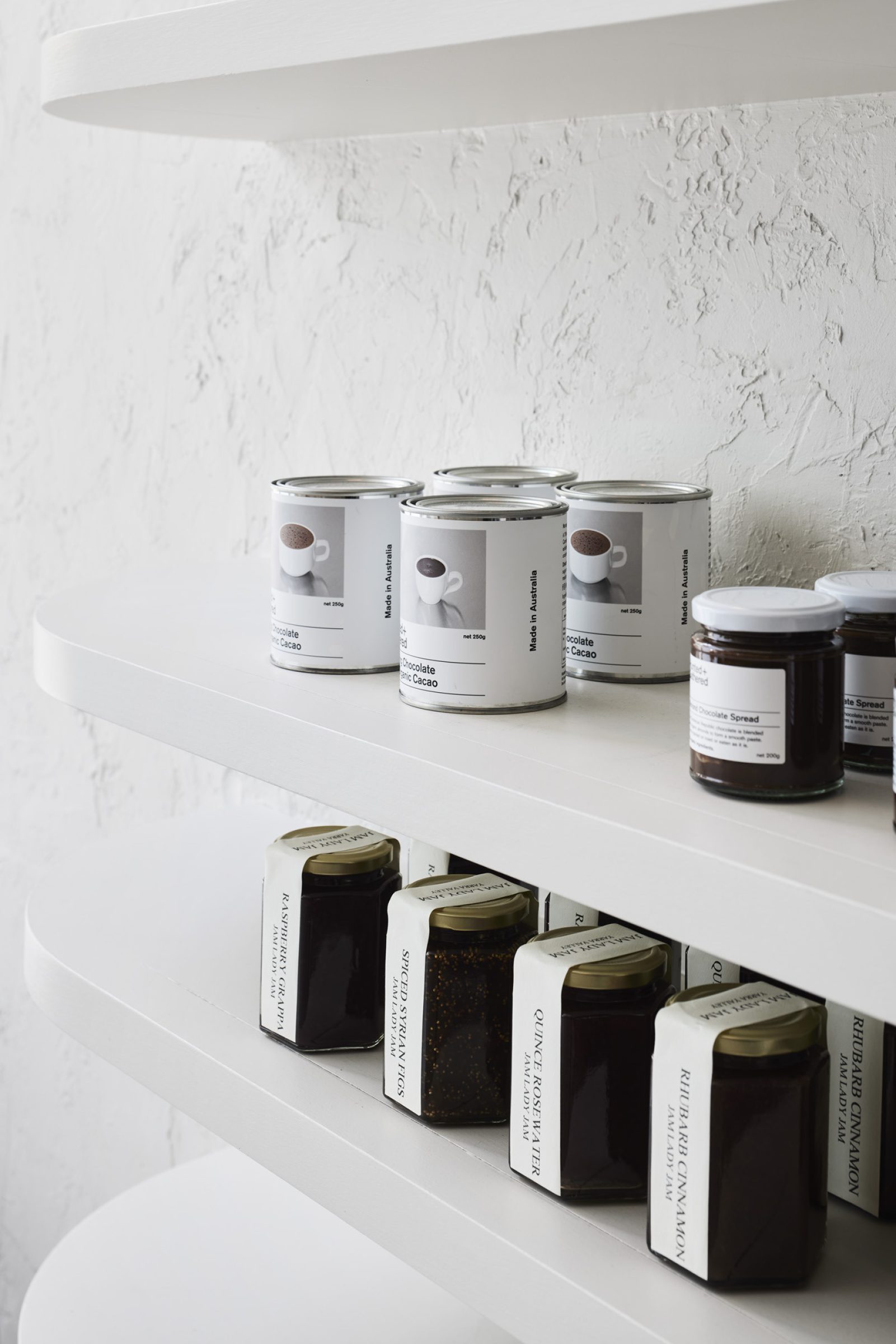
The materiality of each retail display has been designed to contrast with the product it is displaying, therefore highlighting the items available for purchase. The space provides Baker Bleu with the opportunity to entice customers, new and old, further into the fold. A place that exudes restraint, timeless authenticity, and character.
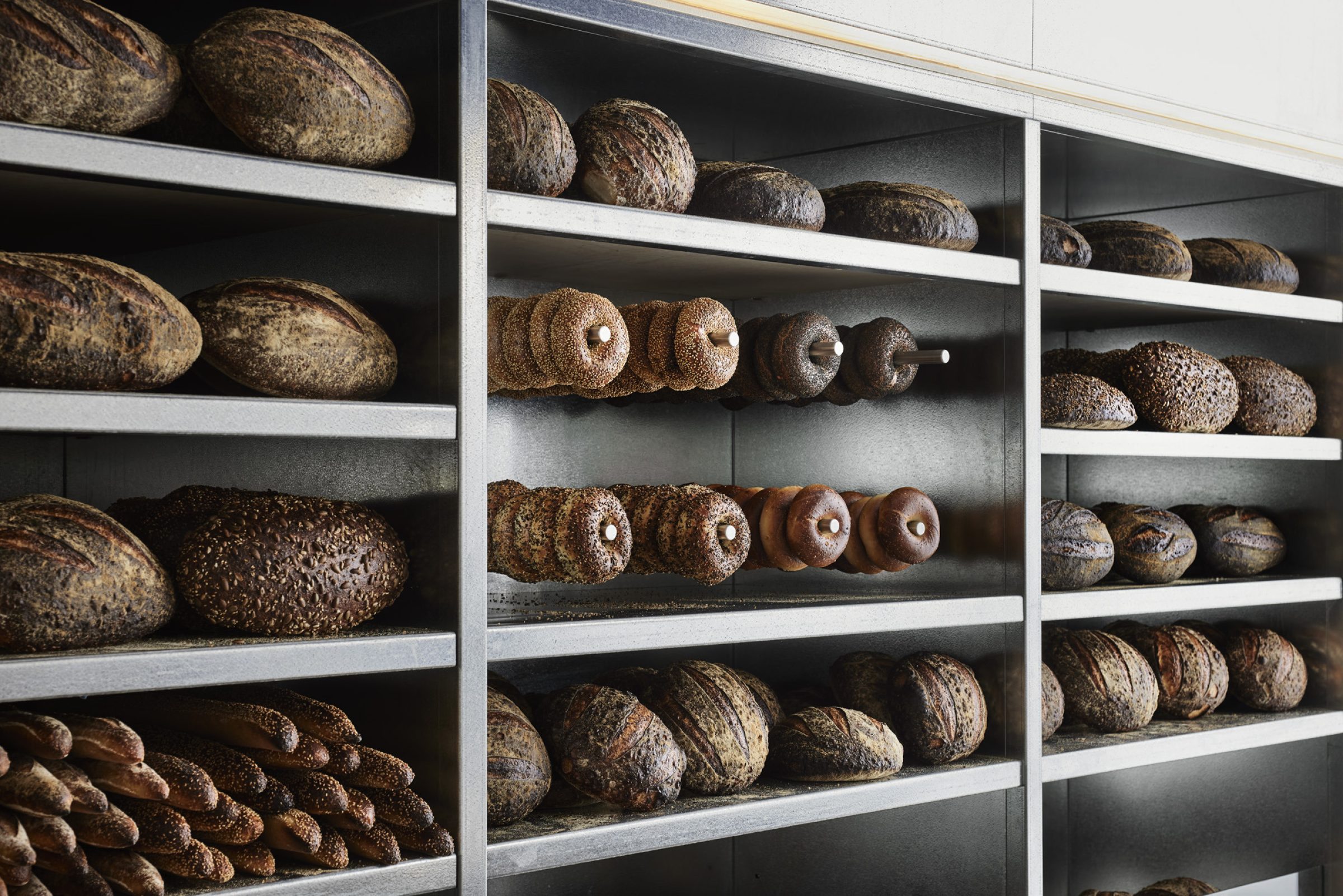
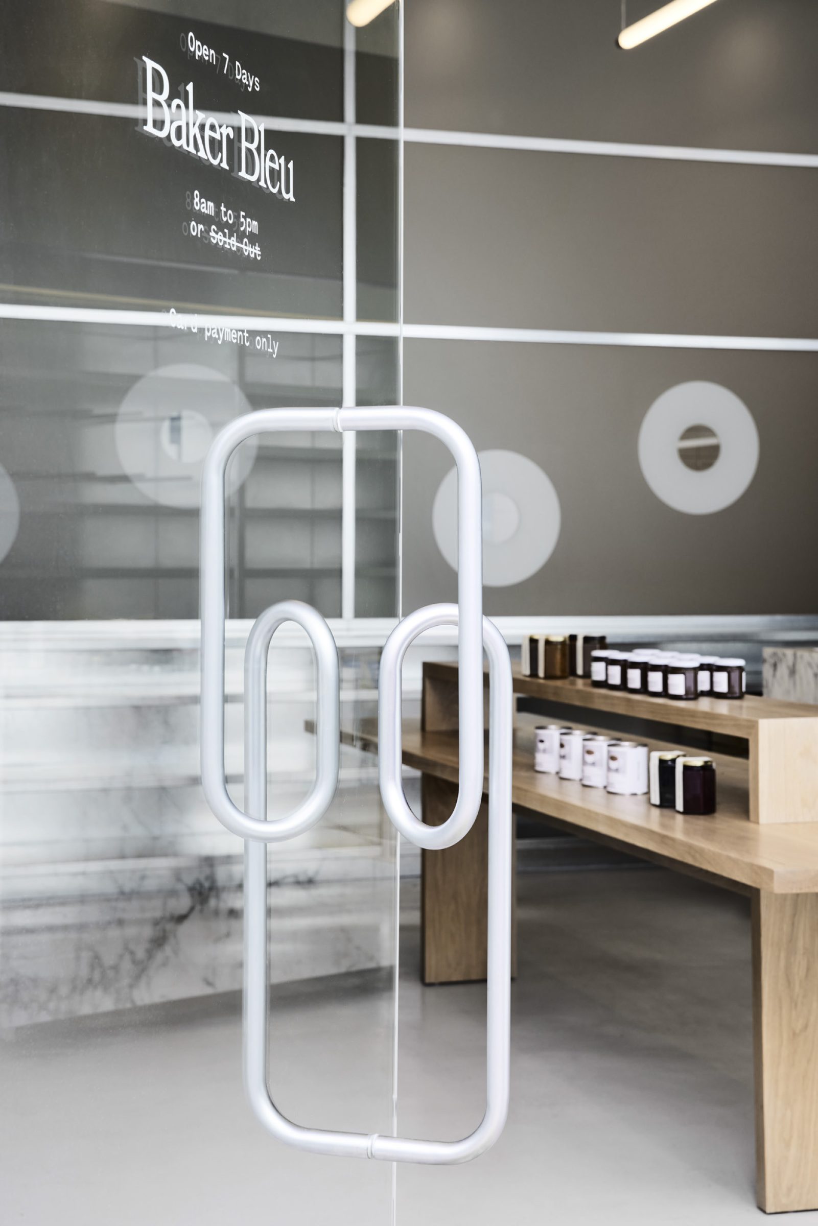
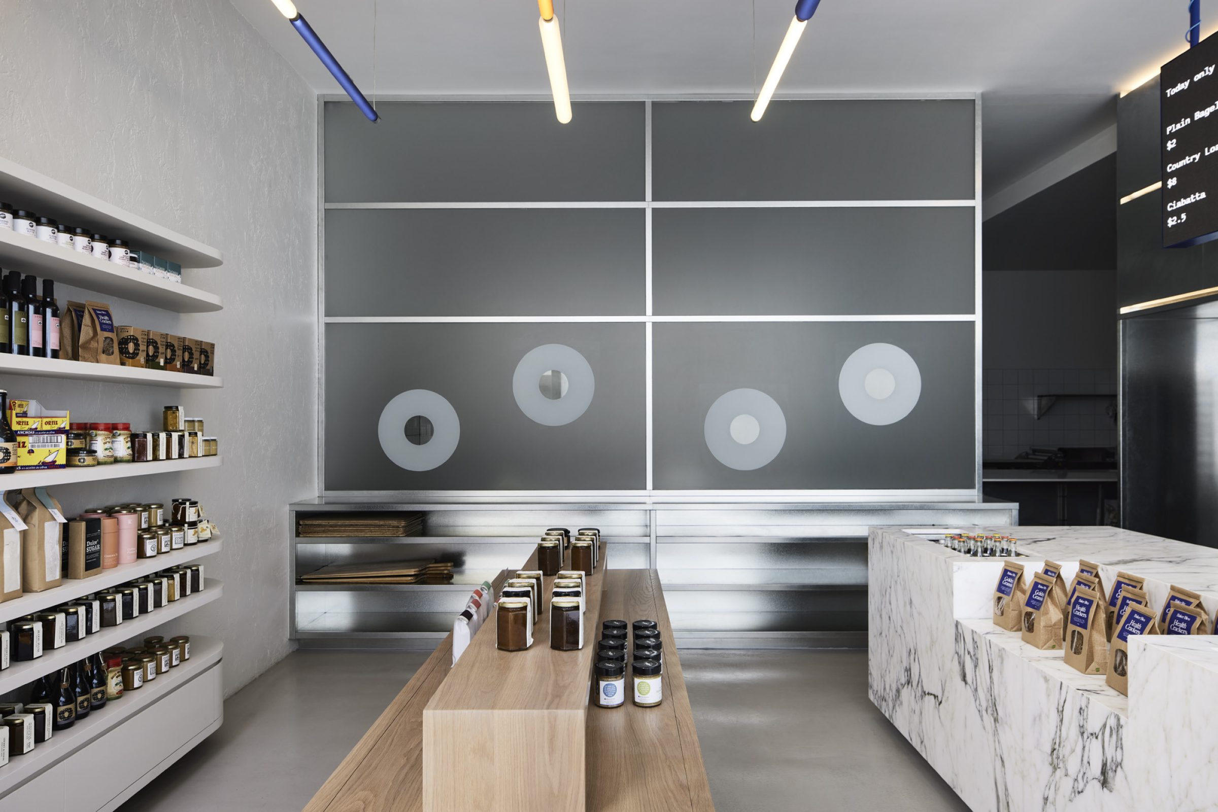
Unexpected materials present throughout the space create tactile touchpoints for retail customers. The vantage point from every retail display has been considered, assuring a layered and multidimensional experience for every customer.
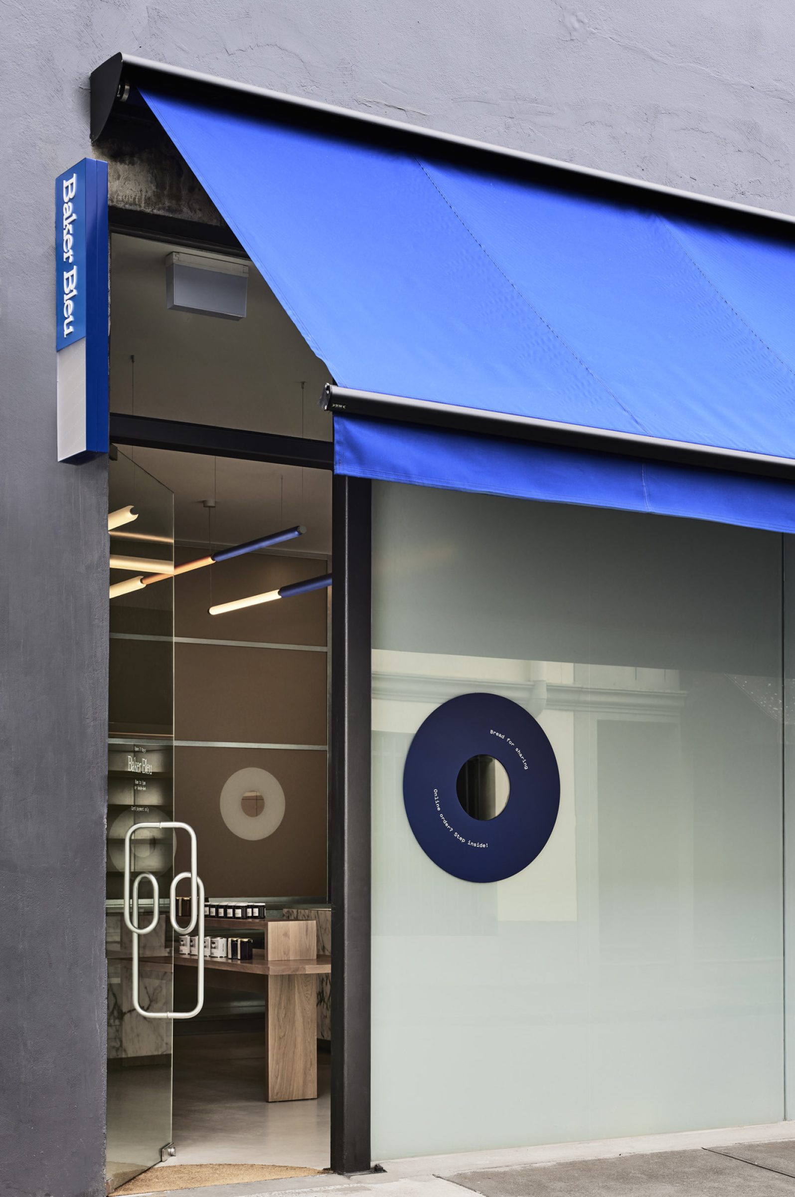
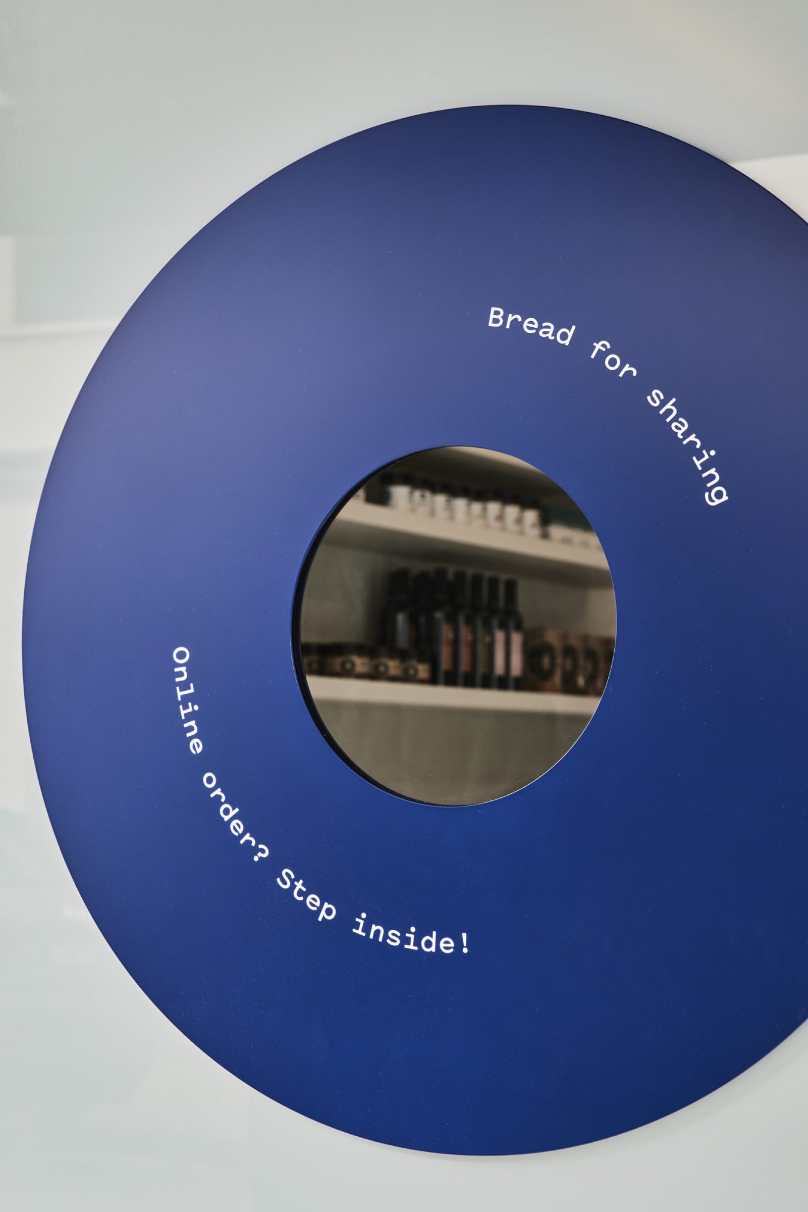
Circular cut-outs in translucent vinyl offer carefully curated views into the retail space and production areas, playfully revealing the activity behind. This sense of exploration and discovery engages patrons and keeps them coming back for more. Always hinting at something beyond, Baker bleu is a reward for curiosity.
Recognition
-
Eat Drink Design Awards 2022 →
Winner
Best Retail DesignThis winning bakery project is significant for the success of its integration of interior and product. There is a great sense of utility about the placement and aesthetics of the bakery product here – the interior experience has struck a careful balance between the minimalism of fittings, finishes and materials and the earthy aesthetics of the actual baked goods as an integrated presentation. In a setting characterised by industrial galvanised metal and sleek minimalism, the bread and other products impart a balancing warmth. A high level of detailing in the resolution of the interior combined with excellent visual branding has resulted in a very resolved, modern setting – specifically designed for the product, easy to clean and serving its core function effectively and expressively.
-
Australian Interior Design Awards 2022 →
Commendation
Retail Design
Media
Credits
Photography: Sharyn Cairns
Branding: Studio Round
Contractor: SCR Construction
